TSA On-Screen Graphics Refresh
Project Type: Motion Graphics & Branding Alignment
The Problem
In 2020, the Transportation Security Administration introduced an updated official seal to modernize the agency’s visual identity. However, no corresponding updates were made to TSA’s on-screen graphics, resulting in a disconnect between branded visuals and official identity. Outdated lower thirds, static end slates, and inconsistent design elements were being used across video content—internally and externally—by over 40 media teams nationwide.
This inconsistency diluted the brand's professional appearance, hindered storytelling cohesion, and missed an opportunity to align TSA's media presence with its renewed visual direction.
Compounding the challenge was TSA’s strict branding and marketing guidelines, which limited design flexibility and required any updates to pass multiple levels of review.
The Solution
After identifying this opportunity, I took ownership to develop a new, unified graphic package that reflected TSA’s modern brand while enhancing usability for teams nationwide.
Redesigned the lower third in a minimalist, modern style that aligned with the 2020 seal update.
Created a custom animated end slate, incorporating the updated seal and official typography.
Introduced brand cohesion by using TSA’s official color palette and wing feather elements from the seal as a visual motif for motion transitions.
Built a plug-and-play After Effects template, enabling ease of use for 40+ internal media teams across the country.
Maintained full compliance with TSA’s strict branding requirements while earning approval and praise from leadership.
Delivered assets using Adobe Creative Cloud, Illustrator, and After Effects.


Results & Recognition
The graphics received overwhelmingly positive feedback from leadership and colleagues alike.
The updated package was distributed across the agency, promoting visual consistency and professional polish.
This initiative played a key role in defining TSA’s refreshed on-screen identity, reinforcing clarity across media.
This Month at TSA
Project Type: Motion Series, Internal Communications, Strategic Storytelling
The Problem
With so much happening across the Transportation Security Administration each month—from mission-critical updates to powerful frontline stories—there was no central, compelling way to unify and share this information across the agency. Leadership communications, internal news, and high-performing social media content were often siloed, making it difficult for employees at all to easy and quickly engage with important information.
There was a clear need for a modern, high-impact way to bring TSA together—one that could cut through the noise, inspire pride, and build awareness around everything TSA touches, not just in aviation, but across all modes of transportation.

The Solution
As part of a larger content strategy pitch to TSA leadership, I developed This Month at TSA, a monthly recap series designed to inform and connect employees—from the front line to HQ. The series curates highlights from across the agency, including standout social media moments, internal storytelling, and key operational updates.
The show’s visual identity and motion design were crafted to reflect TSA’s modern minimalist aesthetic, with an intro concept inspired by the idea of collecting, filtering, and presenting essential moments from the month—visually suggesting TSA’s broad oversight beyond just airports.
Key components:
Designed a clean and compelling animated intro using After Effects and Illustrator
Created all graphics from scratch, adhering to TSA branding guidelines while pushing for a sleek, contemporary feel
Produced 16+ episodes to date, with new episodes released monthly via the agency’s internal platform
Designed for quick, high-impact viewing—each episode is brief, visually engaging, and packed with value


Results & Recognition
This Month at TSA quickly became a must-watch feature. Each episode draws thousands of views within just a few days of release, proving its value as a communication tool that works across roles and ranks. Leadership and staff alike responded with excitement, often resharing the series as a way to spotlight important updates and celebrate collective success.
What began as a creative pitch has become a key pillar in TSA’s internal storytelling strategy—proof that the right design, at the right time, can unite an entire agency around one mission.
The series gone on to win a Gold MarCom Award and a Silver Telly Award.
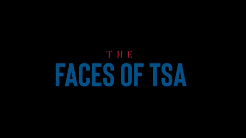
Faces of TSA – Visual Identity Update
Project Type: Cinematic Branding, Motion Graphics, Premiere Pro Templates
The Problem
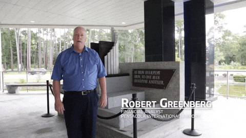
Faces of TSA is the agency’s most emotionally resonant video series—an annual cinematic documentary produced for the yearly 9/11 Remembrance Ceremony, highlighting a TSA employees with personal ties to the events of that day. Despite the powerful storytelling, the on-screen graphics had not kept pace with TSA’s evolving visual identity, missing an opportunity to visually elevate the experience and match the weight of the content.
The existing design—simple lower thirds and title frames—relied heavily on TSA’s primary typeface and colors, which were functional but lacked the drama and visual gravitas this premiere series deserved.

The Solution
Starting in 2023, I redesigned the Faces of TSA visual treatment to reflect a more cinematic, modern, and dramatic aesthetic while still staying within brand standards. The goal was to differentiate this series from day-to-day content and give it a refined, elevated presence fitting its role in the agency’s most important annual event.
Key design choices:
Introduced TSA’s secondary serif font to create elegant contrast and visual hierarchy, allowing names, titles, and locations to stand out.
Used secondary brand colors—often underutilized—to add richness, variety, and depth to the palette while remaining within agency guidelines.
Designed a complete graphic system including lower thirds, title frames, and locator graphics, with stylistic touches, transitions, clean lines, and a bold cinematic layout.
Packaged the system as shareable Premiere Pro templates, enabling editors to maintain consistency and quickly apply the updated visual language.
Results & Recognition
Though exclusive to the Faces of TSA series, the new visual identity has helped set a clear standard for high-level, commemorative content within the agency. The updated look debuted in 2023 and has since been used across multiple installments of the series, reinforcing TSA’s modernized visual brand while honoring its most emotionally charged stories.
The new treatment brings a sense of cinematic polish and professional cohesion to TSA’s most meaningful production—and has become the definitive visual style for one of the agency’s most important moments of the year.